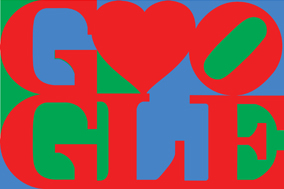
In light of Google’s recent prolific development in dishing out creative doodles on special celebratory occasions, this post will be exclusively dedicated to that particular topic. Over the years, Google has been rather active in integrating their logo design with anything deemed celebratory under the sun from commemorating Les Paul’s birthday to Valentine’s Day. What makes those doodles interesting is the integration of various design elements into the already iconic Google insignia without losing the integrity of the original logo. Even though the manipulations carried out on the original logo seemed fanciful at times, the identity of the brand remains uncompromised.
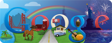
Let's take a look at the doodle the designing team at Google (what a mouthful!) had made to celebrate the Fourth of July celebrations. They managed to put together little design elements that represent America at its best from the cowboy hat-wearing horse to the Sears Tower and even the Florida orange. And the color gradient from light blue to deep purple symbolizes the different time zones for the East Coast and the West Coast. All of these finer design details truly elevate the doodle into something extraordinary and particularly memorable.
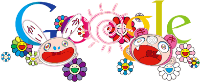
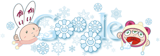 Takashi Murakami's take on illustrating the doodles for both the summer and winter solstice is truly remarkable. The colors used and the characters drawn for the doodle celebrating the summer solstice are simply perfect as they definitely captured what summer or winter is about. The subtleties in the design from the colorful chirpy flower characters to the anime inspired take on the sun are wonderful in capturing the essence of summer. For the winter solstice doodle on the other hand, the snowflakes coupled with the icy-blue tinge on the flower characters managed to bring out the winter theme in the doodle as well. I am particularly fond of the two cartoon characters on each side that really anchor the doodle together as a cohesive piece. The doodle truly is a winter wonderland masterpiece.
The doodle which Google designed to celebrate Les Paul's 96th birthday was definitely the talk of town. Everyone worldwide who managed to log on to Google that day were surprised to find an interactive doodle that enables the user to record the sound of the strumming doodle guitar. The feature of letting users record and share the clip/song produced via strumming the chords truly made it an interactive doodle unlike any other. It became an addictive one as well with many users reported being fixated at strumming the guitar all day long. The popularity of the Les Paul doodle is similar to the doodle Google made to celebrate Pac-Man's 30th anniversary!
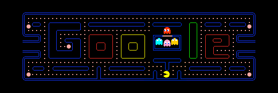
This particular Pac-Man doodle which was playable until the very end (with the reported bug as well) truly celebrates what Pac-Man was all about. And Google was clever enough to integrate their brand into the maze design as well. The entire doodle truly brought back the feeling of how computer games in the 80s look like - pixelated, simple and crazily addictive. Ahh... the good old days.
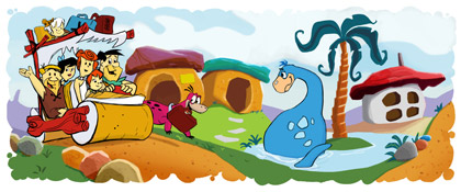
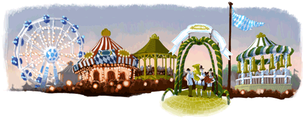
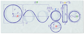
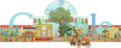
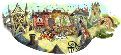
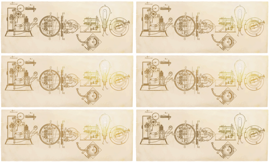
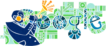
There are many more doodles that are simply captivating and inspiring design-wise. Here are some of my favorites:
 |
| Source: All Google doodle images are copyright of Google (http://www.google.com) |
All of the doodles seen in this post are obtained courtesy from http://www.google.com/logos. You can check out more of the doodles there. I have to say that Google's design philosophy is astounding especially since they are willing to have the Google logo tweaked and manipulated to celebrate a particular event. I definitely cannot wait for the next Google doodle. Doodle away!









No comments:
Post a Comment