Recently Lionsgate released a motion poster design for The Hunger Games movie and the Internet was abuzz with many being amazed by the motion poster that managed to capture their attention. Is a motion poster design the next step for film distributors to market their movies instead of the conventional (static) poster design? It could possibly be the next step (similar to the potentials of 3D movies) in designing a poster. Certainly designers will find it a welcome challenge in designing a motion poster that not only helps in promoting a particular product or service but also captures the imagination of the target audience.
One of the main reasons why a motion poster is more popular is due to it being different as it is animated. It is not often that you come across a motion poster (unless you count those cliche web-banner advertising you stumble on a website) that is vivid and captivating. Not only does a good motion poster breathes life into the entire design, it can also catapult the commercial attractiveness of the product or service being marketed. In the case of The Hunger Games, it helps to generate interest in the movie. I have embedded the movie poster below for you enjoyment.
The widespread popularity of The Hunger Games motion poster is any indication, in the future we might be seeing more and more movie posters being marketed as motion posters. It would be interesting to see how the designers approach in terms of designing the motion posters as care would be taken not to make the motion poster design to be overtly complicated or even too simple as well. They have to strike a fine balance between something that is great yet understated. Looking forward to see more motion poster designs in the near future and you will be kept posted if I come across any!
Thursday, July 21, 2011
Friday, July 15, 2011
How (Not) To Deal With Rude Customers?
Once in a blue moon, you are bound to encounter a customer (or two) who are inexplicably rude. No matter how polite you seem to be, how accommodating you can be or even how generous you force yourself to be, you are bombarded with rude remarks coupled with unreasonable demands. So how do you go from there? Slap him or her in the face, point blank? Smile and try your best to handle the individual’s request through gritted teeth? Or simply ignore the person entirely? As some would say, ignorance is bliss, no?
Well, here are some tips based on personal experience:
1) Keep your cool.
I know it is hard to stay calm at times but it is imperative to do so especially if the customer’s remarks are uncalled for, vulgar, ridiculous, you name it. Sometimes, by staying calm you will be able to respond in a sound and matured manner. And that is probably a good way to start things off on a good note.
Real Case Scenario:
A Slovakian client complained:
“Unfortunately the designs you presented are unacceptable. Amateurish, conceptually wrong and completely useless to us. It seems like you have no clue how to grasp the essence of our business and no design skills. The ideas you presented are totally besides the pot.”
Response:
- Hmmm… Isn’t that a tad harsh – “completely useless” and “no design skills”? Geez.
- And what did he mean by “besides the pot”? Are we Slovakian witches or something brewing something in a pot? Double, double, toil and trouble?
- When he said that the designers had “no clue” on “how to grasp the essence of our business”, who else to blame but he himself. The description given for the logo design was: “innovative, witty, fresh, jaw-dropping, great, awesome and cool”. Yeah… being abstract seals the deal.
- So the best thing to do is soldier on by responding appropriately and apologizing for not meeting his requirements. Also, ask for what he wants to avoid any future mishaps. And we hope that the complaining would end. But…
2) Respond politely.
Sometimes a customer will rant on and on about something that is not even relevant. The only way to counter this is to respond politely. Try sympathizing with the customer, he or she might be having a bad day. Use the best of your abilities to make the customer feels that he or she is right even though they are wrong. Customer is king? Probably. But they are not god.
Real Case Scenario:
A Slovakian client complained (yes, it is the same person and it is a tad long; what do you expect from an unreasonable complainant, right?):
“I had good belief and trust that this is a professional service with professional people at work and paid the money for the best package to get the best possible result. I did not expect some tryout service for blind idiots without an opinion who are happy with such amateur work as you presented so far. To your explanation "just so you know" of what the logos are supposed to mean. I am fully aware of all you said... I am not stupid or blind!
I feel like a design teacher already but these are the qualities I expect to see in a professional logo. And it can be very simple. I gave you examples of great logos already and explain a bit. Why the Apple logo is great: its an icon that doesnt need explanation or logotype, it represents wisdom and innovation - Newton's apple, in christian culture the Adam and Eve's apple of wisdom, the concept of a center where stuff is happening - big apple = new york, the concept of education, progress...
I should charge you for teaching you how to make a logo great :-)))”
Response:
- “Blind idiots”? Really? Stooping that low? And we are well aware that you are not blind. How could you be blind if you can complain about a logo design that is good to begin with? About being stupid, we didn’t say you are. But I think it is implied from your choice of words.
- You are a design teacher now? Let’s see some of your “constructive criticism”:
“Forget about the letters N or C ! You are hooked on that concept and you are stuck with it. Its wrong! You are repeating it over and over... Even your own logo is done that way... which is not impressive at all for a design company. But that is your business.
For us try to create a dynamic modern icon that represents webcasting, videostreaming, delivery of video to individual internet users, the process of delivery of video information to many, data flow or anything you can come up with in this direction. This industry is full of symbols... so analyze what the common graphical elements are and extrapolate from that. Avoid plain stupid descriptivenes like globes, wires, tv screens or any other primitive and overused symbolism like that. Be original, fresh and new!
Font usage: it should be modern, bold, well legible, innovative, inspiring. Its not enough to just use a font. I have thousands of font in my computer and can find thousands others on the net. The trick is to use a certain visual characteristic quality of a font and build on it, emphasize the hidden aspect of the font by slight modification which supports or combines with the iconic element of the logo. Again this should be done in a very original and inspiring way!
The use of font: the arrangement of the words in the comany name should be very original, innovative, unseen, inspiring, witty, with a surprising twist, simply something that makes you go WOW!”
I bet you are the best design teacher out there. Your choice of words and descriptions are of tremendous use. You truly made us go WOW.
- If the complaint had drag for this long, it is best to simply ask the customer what he or she wants from this complaint. It is a waste of time (yours and his/hers) as well as energy. You could have been doing something more productive than this. Even strangling the customer yields some instant gratification.
3) Remember of your other kind and polite customers.
Do not let one rotten apple spoil it all. In the service industry, you are bound to come across a few difficult customers to work with but you are more likely to encounter more who are friendly and polite. Think back on the many nice customers you have served and erase the bad ones. When erasing the bad ones, it is still recommended to end things on a positive note (with or without sarcasm).
Real Case Scenario:
A Slovakian client complained (who else? He is having a really bad hair week. We think):
“I regret very much to have to say that all of the work you presented is disappointing and unacceptable for me! I went through all 65 pages of your portfolio to get a good overview of your other work. Some of the logos are OK, I'd rate them as average and standard, but none is truly classy or brilliant. Surprising is that the work you did for us is substandard even for your standards. Most of your logos in the portfolio are better than ours. That is strange! It could be a matter of first impression. I know nothing about the businesses and was evaluating the visual side of the logos only.”
Response:
- If he has already a preconceived judgment on the logo designs (based on the portfolio) why then does he want to engage with the company? I find that this does not make any sense. At all.
- Substandard? There he goes again with the low blow.
- But the best part was when he wrote these words:
“I'd like to request that you please refund my payment. Thank You!”
Phew… Glad that was over. And he ended with a “thank you”. So it is best to end with a thank you as well. “Thank you for considering choosing us and we hope you will be successful on your quest on getting the perfect logo design. We wish you all the best.” Hope we don’t meet again? Please?
Coping with rude customers is not easy. It takes a lot of work. But with a bit of wit and patience, an encounter with a rude customer can be turned into a learning experience. Service with a smile. An emoticon will do just fine at times. :)
Thursday, July 7, 2011
The Doodles by Google
In light of Google’s recent prolific development in dishing out creative doodles on special celebratory occasions, this post will be exclusively dedicated to that particular topic. Over the years, Google has been rather active in integrating their logo design with anything deemed celebratory under the sun from commemorating Les Paul’s birthday to Valentine’s Day. What makes those doodles interesting is the integration of various design elements into the already iconic Google insignia without losing the integrity of the original logo. Even though the manipulations carried out on the original logo seemed fanciful at times, the identity of the brand remains uncompromised.
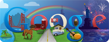
Let's take a look at the doodle the designing team at Google (what a mouthful!) had made to celebrate the Fourth of July celebrations. They managed to put together little design elements that represent America at its best from the cowboy hat-wearing horse to the Sears Tower and even the Florida orange. And the color gradient from light blue to deep purple symbolizes the different time zones for the East Coast and the West Coast. All of these finer design details truly elevate the doodle into something extraordinary and particularly memorable.
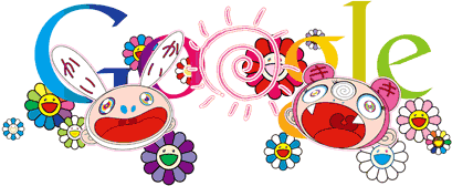
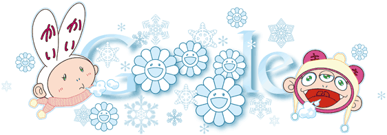 Takashi Murakami's take on illustrating the doodles for both the summer and winter solstice is truly remarkable. The colors used and the characters drawn for the doodle celebrating the summer solstice are simply perfect as they definitely captured what summer or winter is about. The subtleties in the design from the colorful chirpy flower characters to the anime inspired take on the sun are wonderful in capturing the essence of summer. For the winter solstice doodle on the other hand, the snowflakes coupled with the icy-blue tinge on the flower characters managed to bring out the winter theme in the doodle as well. I am particularly fond of the two cartoon characters on each side that really anchor the doodle together as a cohesive piece. The doodle truly is a winter wonderland masterpiece.
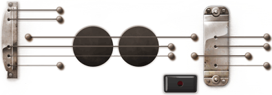
The doodle which Google designed to celebrate Les Paul's 96th birthday was definitely the talk of town. Everyone worldwide who managed to log on to Google that day were surprised to find an interactive doodle that enables the user to record the sound of the strumming doodle guitar. The feature of letting users record and share the clip/song produced via strumming the chords truly made it an interactive doodle unlike any other. It became an addictive one as well with many users reported being fixated at strumming the guitar all day long. The popularity of the Les Paul doodle is similar to the doodle Google made to celebrate Pac-Man's 30th anniversary!
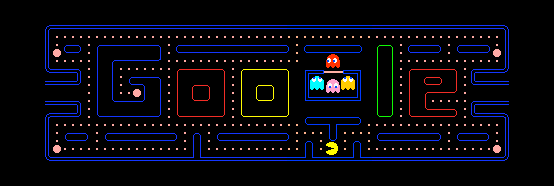
This particular Pac-Man doodle which was playable until the very end (with the reported bug as well) truly celebrates what Pac-Man was all about. And Google was clever enough to integrate their brand into the maze design as well. The entire doodle truly brought back the feeling of how computer games in the 80s look like - pixelated, simple and crazily addictive. Ahh... the good old days.
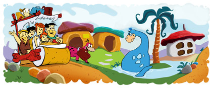
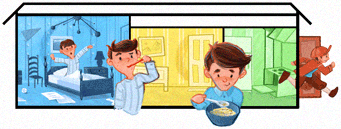
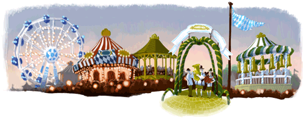
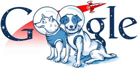
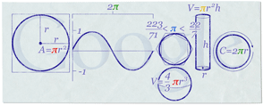
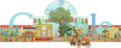
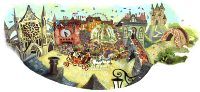
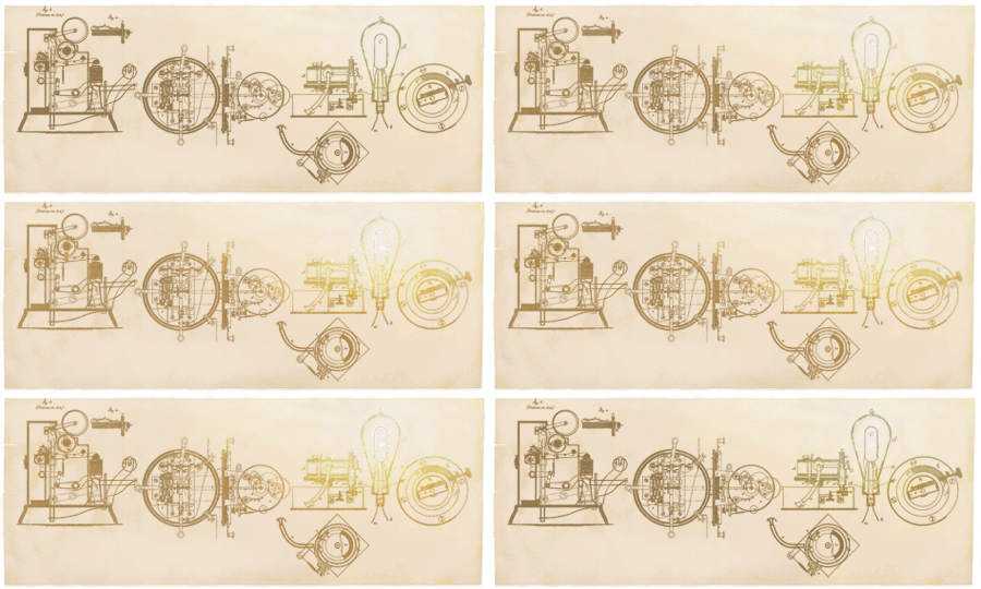
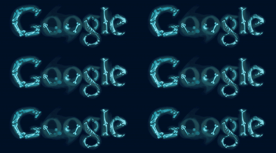
There are many more doodles that are simply captivating and inspiring design-wise. Here are some of my favorites:
 |
| Source: All Google doodle images are copyright of Google (http://www.google.com) |
All of the doodles seen in this post are obtained courtesy from http://www.google.com/logos. You can check out more of the doodles there. I have to say that Google's design philosophy is astounding especially since they are willing to have the Google logo tweaked and manipulated to celebrate a particular event. I definitely cannot wait for the next Google doodle. Doodle away!
Subscribe to:
Comments (Atom)


